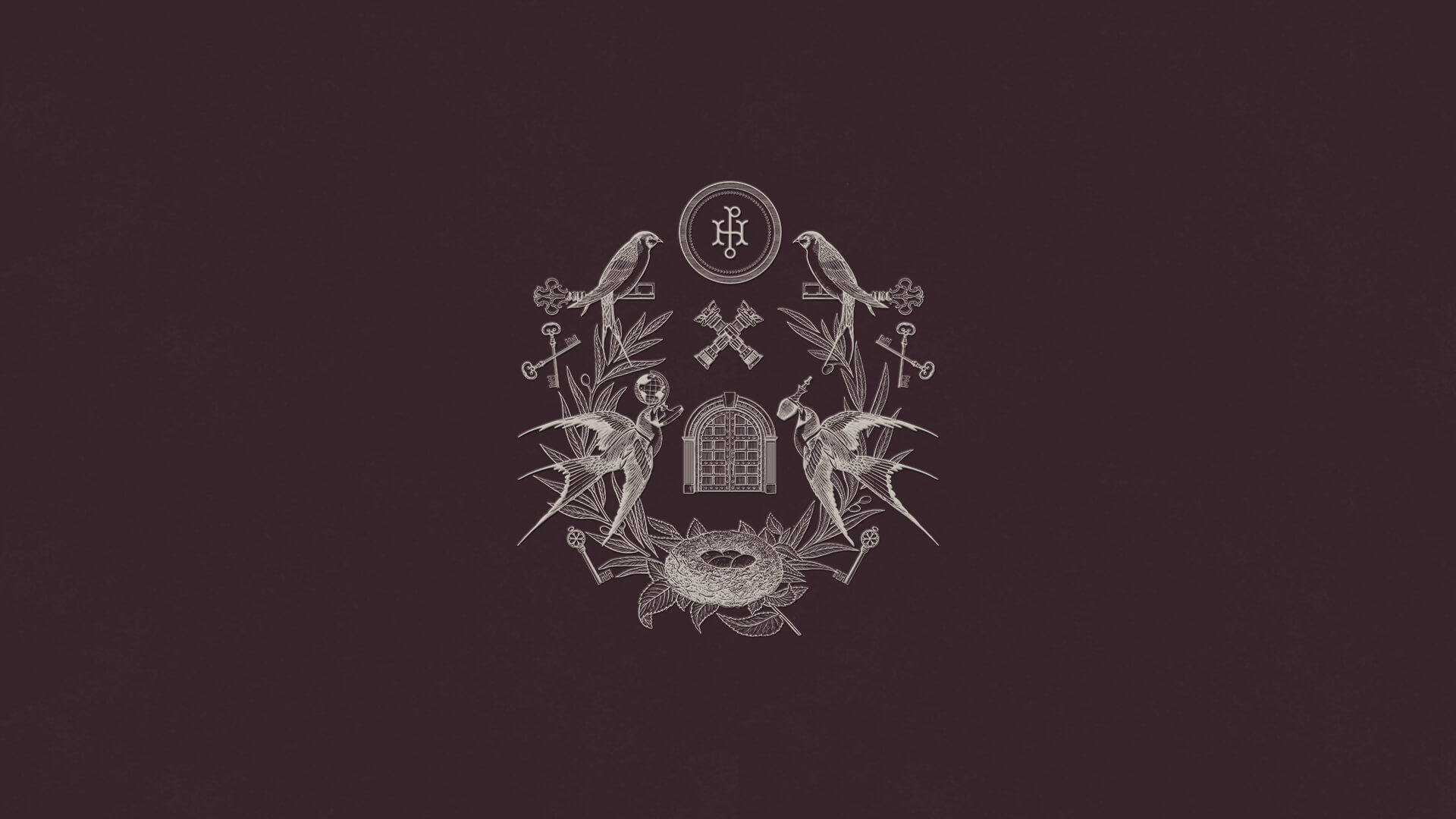

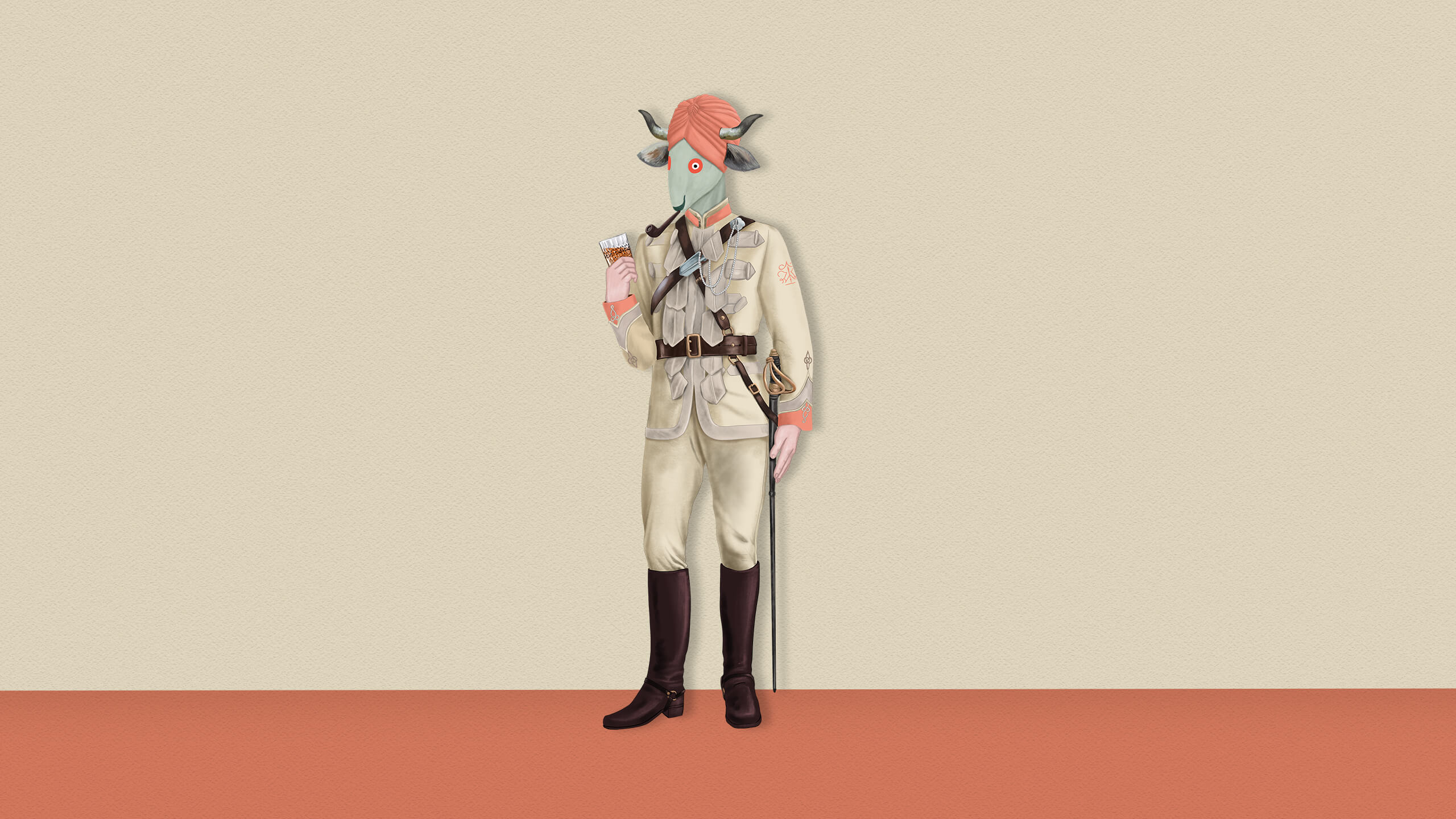

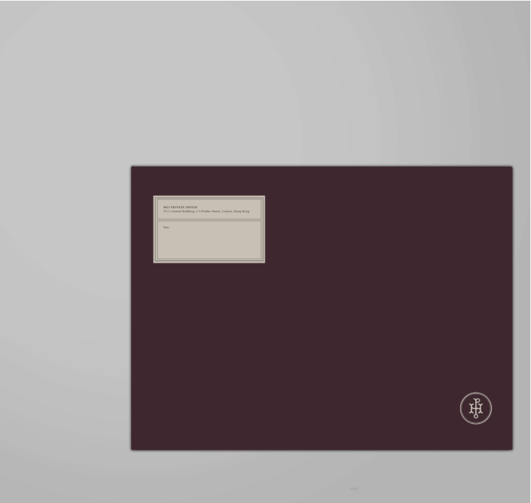
Coat of Arms For Hong Kong's Royalties
CLIENT
_
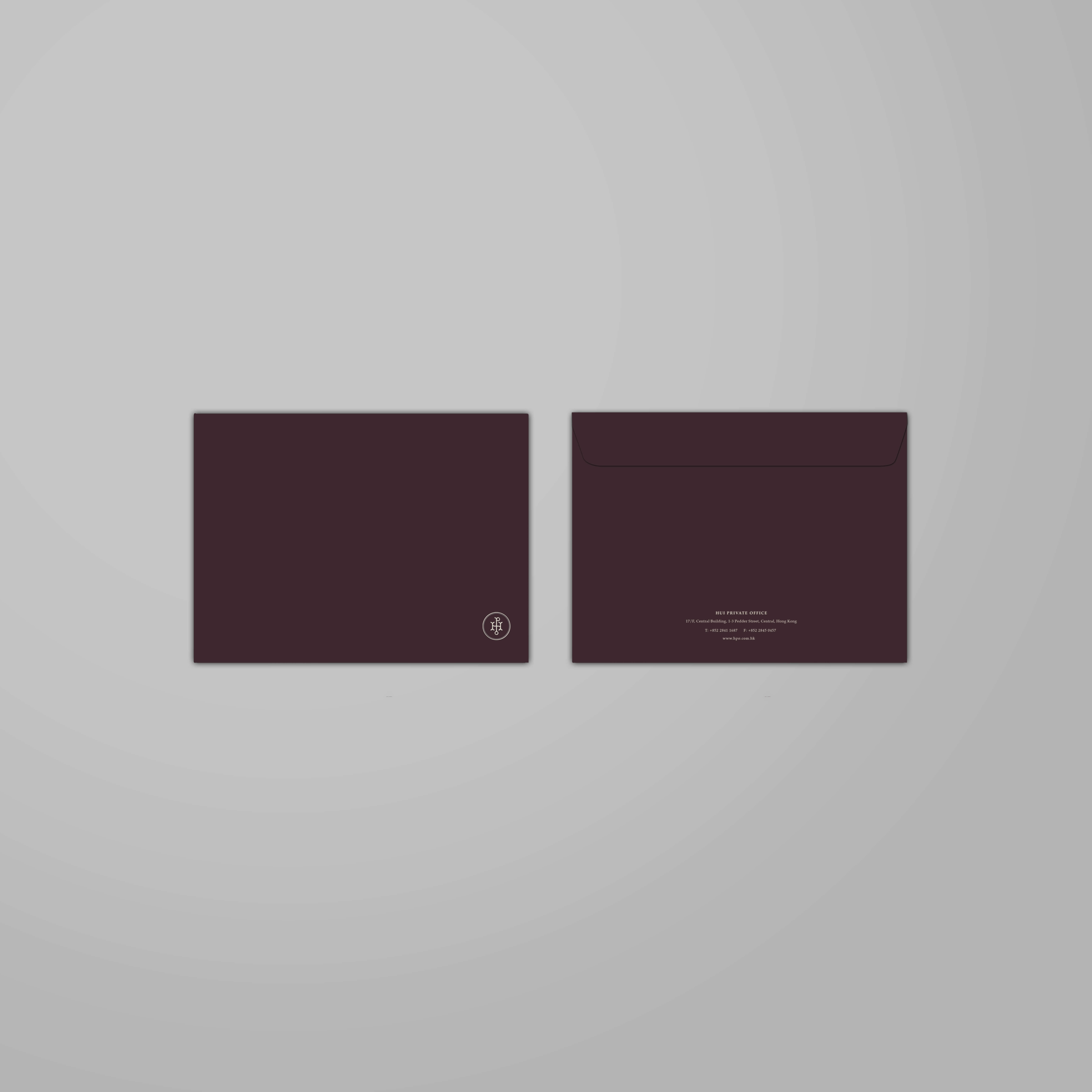
Hui Private Office
MOMENT
_
2017
INDUSTRY
_
Corporate Office, Family
SERVICES
_
Brand Concept, Brand Identity, Signage Design, Creative Direction, Collaterals Development, Print & Digital Production
PROJECT DESCRIPTION
_
Hpo is an organizational structure that manages the financial and personal affairs of the Hui family group. A lean enterprise comprising of a mix of family members and professionals with expertise in areas ranging from financial investments, corporate affairs, philanthropic initiatives, education and more. With the Hui family being one of Hong Kong's top four families, the brand identity takes inspiration from the traditional coat of arms to pay homage to their heritage. It also includes a modern icon within the crest which makes it a unique brand for the corporate world. Completed whilst at substance, under the creative direction of Maxime Dautresme. Team of two with me as lead brand designer.

Concept: The Collective of Legacy
The swallow is a messenger of fortune and wealth in chinese culture, and is seen as a symbol of loyalty and affection towards family. Just like the hui private office, the culture does not favour personal bravado; in which comprises of family members and talents that progress together as one. This concept celebrates the strong sense of unity, whilst upholding individualism and legacy.


Design
The identity draws inspiration from traditional Coat of arms. With unique hand drawn elements representing each pillars within the corporate enterprise, the crest celebrates a strong sense of unity, heritage and legacy.
